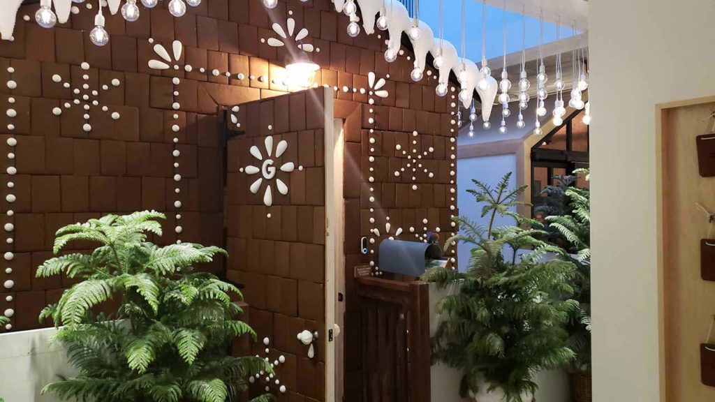
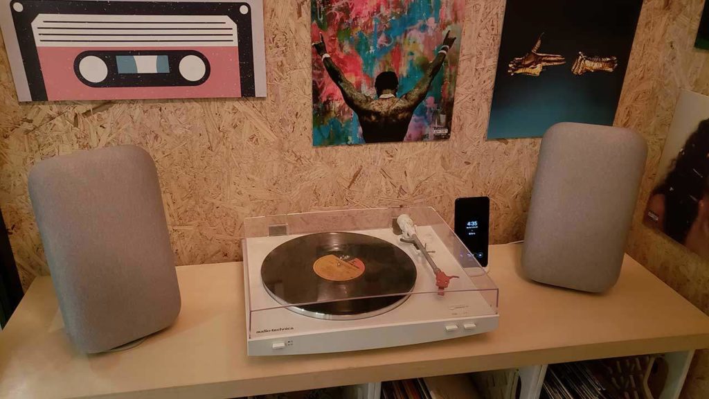
When I’ve first heard about Google opening up a hardware store in Chicago’s Bucktown during mid-October, I was very excited. I’ve been following Google’s development for quite some time now in the industry. I, myself, am a big fan of smart devices and find the concept of having a smart-home nifty. Finding out a store was opening with demos of their products sparked the inner-child within me.
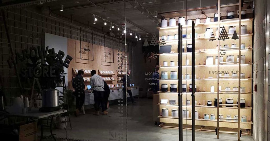
The exterior was stunning.
The first photo above does not do Google any justice, but the exterior was stunning. Upon arriving at the entrance, there was a nice beautiful display with lighting. The way the room was lit up and all the smiles of the staff through the glass windows was a very inviting sensation. You can even see some of the products on display already without stepping into the building.
I felt welcomed.
One of the biggest pet peeves’ I have is walking into a store and not feeling welcomed. For Google, this wasn’t the case. I was greeted, like everyone else who entered the store behind me, very professionally. After exchanging some hi’s and how are you’s I was then asked if it was my first time at the store. Since it was my first time, everything was explained to me very carefully. I was even giving a small booklet to collect some of the fun cards scattered throughout the store.
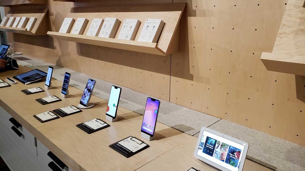
Not only did I felt welcomed, but this was one of the few moments where it honestly felt like it was okay to explore and no one would judge me for it. Being able to test out some of the new phones and displays were amazing. I even asked a couple of questions and was told everything down to the last detail.
The first floor was well designed.
As I went farther in, I notice in the back there was a gift wrapping station and a checkout area. At the checkout, you were able to purchase some of the devices and get them wrapped up as gifts. To me, I think this was a pretty smart design choice. Had the checkout area been in front, I’m sure many people would have stared at the price chart and left. I believe many stores suffer from this before their consumers are even able to try the product.
The second floor was where it all begins.
It wasn’t until I got to the second floor was when I realized there was a lot more to explore. Right when I got to the second floor, I was greeted by more staff members. The second floor contained a few more activities that genuinely bought out the Google experience.
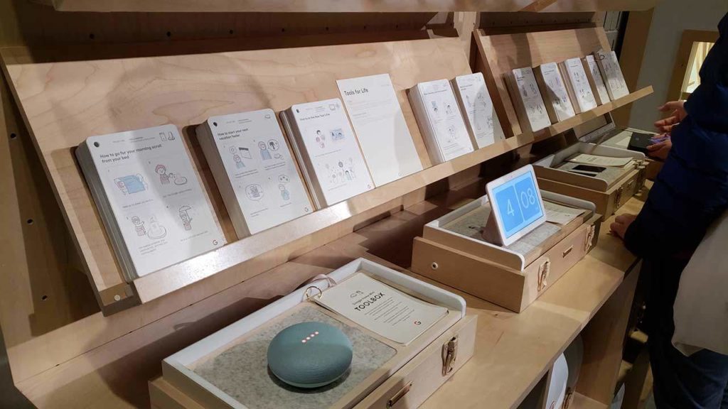
The very first station I approached was the toolbox station. By exchanging my Driver’s License/State ID, I was able to take one of the toolbox’s and sit down and interact with whatever product was inside it. It was a much more different experience being able to sit down by myself to test out all of a device’s features.
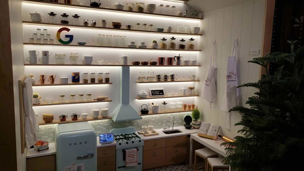
The kitchen gave me candy.
The “Kawaii Kitchen” as they called it was a beautiful little display of how the Google Home Hub could help you in the kitchen. It was not only just a display, but it was also an interactive demo. The staff member walked me through various examples of how the hub could be used to help out in the kitchen and even told me to say, “Hey Google. It’s snack time.” To magically see a kitchen drawer get pushed out filled with candy.
The treehouse was every child’s dream.
One of my most favorite interactive displays was hands down the treehouse. The treehouse contained products that gave off the real sense of a smart home. Upon entering the treehouse, I got told about the treehouse rules, which were just phrases to say. Each sentence was a Google action that performed different things. I also was given time to be in the treehouse alone. I was able to play music, change the colors of the light, see the front and back door cameras and do various activities just by talking to the hub. There were small phrases hidden all around the inside of the treehouse.
You got to love the bass.
The loudest displays were the Google Home Max. The small little record room was designed to give off the perfect record label vibe. It was a very musical experience. Together with the Google Pixel, the Home Max was able to play almost any song you asked the Pixel to perform. Not only was I able to listen to some of my favorite music, but I was also able to hear it at full volume with the door closed.
The photoshoot.
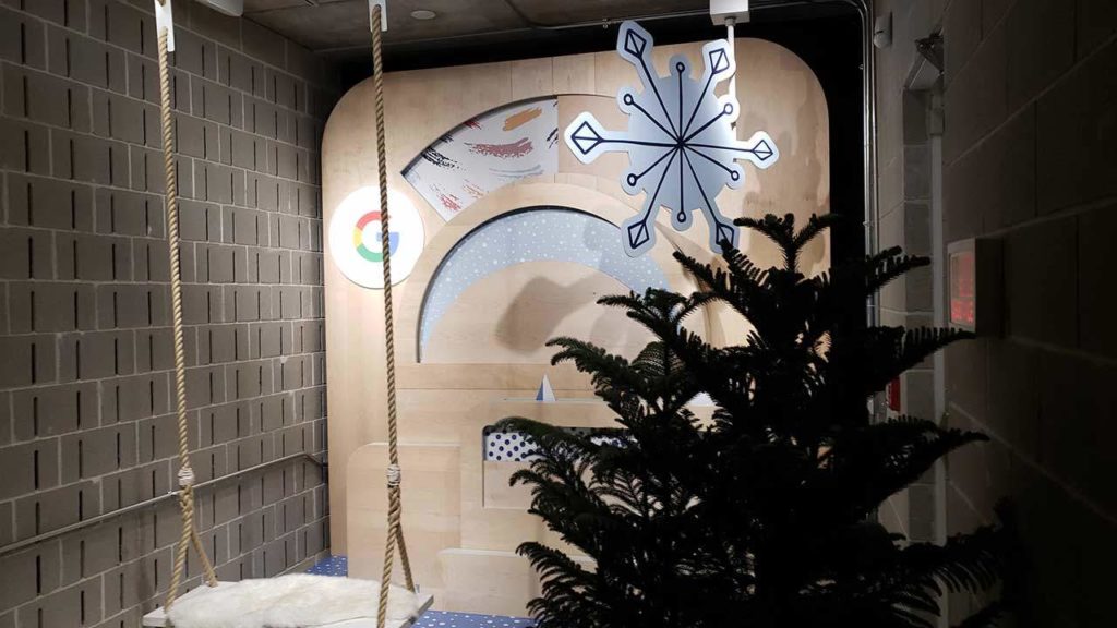
The last small area was the photoshoot area, where Google demoed their top shot feature. All you had to do was get on the swing and backdropped space opened up to display a beautiful design. As you are swinging on the swing, a staff member takes multiple shots of you with the top shot and then proceeds to show you how it works on the Pixel.
The overall experience.
The overall experience of the Google Pop-up was hands down one of the best-designed places I’ve been to in a long time. Not only was the staff friendly but this was a genuine place to demo and test out the vast amount of Google products. Not only did I get to test the devices but I was able to see how everything came together and worked with not only each other but third-party products.
The second floor added in a different layer of experience and brought in not only a fun perspective but an emotional one as well. The Google Pop-up felt more like an interactive exhibit than a store. The experience was well designed, and I applaud Google for giving us this beautiful take on how products can and should be displayed.
